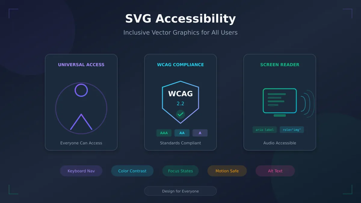
SVG Accessibility: Creating Inclusive Vector Graphics for All Users
By SVG AI Team
ai svg generatorsvg accessibilitywcaginclusive designsvg generator
Accessible design is no longer optional. With legal requirements like the ADA, Section 508, and the European Accessibility Act, plus an estimated 1.3 billion people worldwide living with disabilities, creating SVG graphics that everyone can perceive and interact with is both a moral imperative and a business necessity. Yet SVG accessibility remains one of the most overlooked aspects of web development.
This comprehensive guide covers everything you need to know about making SVG graphics accessible, from basic screen reader support to advanced ARIA patterns for complex interactive visualizations. Whether you're creating graphics with our AI SVG Generator or hand-coding intricate data visualizations, these techniques will ensure your work reaches every user.
Why SVG Accessibility Matters
The Scale of Impact
Consider the numbers:
- 285 million people globally have visual impairments
- 466 million people have disabling hearing loss
- Over 2 billion people require assistive technologies at some point in their lives
- 15% of the world's population experiences some form of disability
When you create inaccessible SVGs, you're potentially excluding a significant portion of your audience. For enterprise and government clients, this isn't just about user experience—it's about legal compliance and avoiding costly lawsuits.
Legal Requirements
Multiple regulations now mandate digital accessibility:
United States:
- ADA (Americans with Disabilities Act): Applies to public accommodations, increasingly interpreted to include websites
- Section 508: Requires federal agencies to make electronic content accessible
- State laws: California, New York, and others have additional requirements
European Union:
- European Accessibility Act (EAA): Requires accessible digital services by June 2025
- EN 301 549: Technical standard for ICT accessibility
Global:
- WCAG (Web Content Accessibility Guidelines): The international standard, with WCAG 2.2 being the current version
Business Benefits Beyond Compliance
Accessible design often improves the experience for all users:
- Better SEO: Screen reader optimization often aligns with search engine best practices
- Improved usability: Clear structure and labeling help everyone
- Broader reach: Accessible content reaches more potential customers
- Future-proofing: Accessibility standards only become more stringent over time
WCAG Compliance for SVGs
The Web Content Accessibility Guidelines provide the framework for accessible design. Here's how they apply specifically to SVG graphics.
Relevant Success Criteria
1.1.1 Non-text Content (Level A):
All non-text content must have a text alternative that serves the equivalent purpose. For SVGs, this means providing appropriate alternative text through <title>, <desc>, or ARIA attributes.
1.4.1 Use of Color (Level A): Color cannot be the only means of conveying information. If your SVG chart uses color coding, provide additional visual cues like patterns, labels, or shapes.
1.4.3 Contrast (Minimum) (Level AA): Text and images of text must have a contrast ratio of at least 4.5:1 (3:1 for large text). SVG text elements must meet these requirements.
1.4.11 Non-text Contrast (Level AA): UI components and graphical objects must have a contrast ratio of at least 3:1 against adjacent colors.
2.1.1 Keyboard (Level A): All functionality must be operable via keyboard. Interactive SVG elements must be focusable and respond to keyboard events.
2.4.7 Focus Visible (Level AA): Keyboard focus must be visible. Interactive SVG elements need clear focus indicators.
Compliance Levels Explained
WCAG defines three conformance levels:
| Level | Requirements | Typical Use Case |
|---|---|---|
| A | Minimum accessibility | Basic legal compliance |
| AA | Standard accessibility | Most legal requirements (recommended target) |
| AAA | Enhanced accessibility | Maximum accessibility (optional) |
Most organizations target Level AA compliance, which balances accessibility with practical implementation constraints.
Making SVGs Screen Reader Friendly
Screen readers are assistive technologies that convert on-screen content to speech or braille. Making SVGs work well with screen readers requires specific techniques.
The Role Attribute
First, establish that your SVG should be treated as an image by screen readers:
<svg role="img" aria-labelledby="titleId descId" viewBox="0 0 100 100">
  <title id="titleId">Company Logo</title>
  <desc id="descId">A blue circle with the letters XYZ in white</desc>
  <!-- SVG content -->
</svg>
The role="img" tells assistive technologies to treat the entire SVG as a single image rather than announcing each element.
Title and Description Elements
SVG provides built-in accessibility elements:
<title> Element:
- Provides a short, concise name for the graphic
- Equivalent to the
altattribute on<img>tags - Should be the first child of the SVG or the element it describes
- Keep it brief (under 125 characters)
<desc> Element:
- Provides a longer description for complex graphics
- Useful for charts, diagrams, and illustrations
- Can include detailed information about what the graphic represents
<svg role="img" aria-labelledby="chartTitle chartDesc" viewBox="0 0 400 300">
  <title id="chartTitle">Q4 2026 Sales Performance</title>
  <desc id="chartDesc">
    Bar chart showing monthly sales. October: $45,000.
    November: $52,000. December: $78,000.
    December shows the highest sales, 73% above October.
  </desc>
  <!-- Chart elements -->
</svg>
Hiding Decorative SVGs
Not every SVG needs to be announced. Purely decorative graphics should be hidden from screen readers:
<!-- Decorative SVG - hide from screen readers -->
<svg aria-hidden="true" focusable="false" viewBox="0 0 100 100">
  <!-- Decorative pattern or background -->
</svg>
Key attributes for decorative SVGs:
aria-hidden="true": Hides from assistive technologiesfocusable="false": Prevents keyboard focus in some browsers
When using an SVG generator for decorative elements, remember to add these attributes to the output before deployment.
Practical Examples
Icon with visible label:
<button>
  <svg aria-hidden="true" focusable="false" width="24" height="24">
    <path d="M3 12l2-2m0 0l7-7 7 7M5 10v10a1..."/>
  </svg>
  <span>Home</span>
</button>
The icon is decorative because the button has visible text.
Icon-only button:
<button aria-label="Close dialog">
  <svg aria-hidden="true" focusable="false" width="24" height="24">
    <path d="M6 6l12 12M6 18L18 6"/>
  </svg>
</button>
The aria-label on the button provides the accessible name; the SVG itself is hidden.
Standalone meaningful graphic:
<svg role="img" aria-labelledby="logoTitle" viewBox="0 0 200 60">
  <title id="logoTitle">Acme Corporation</title>
  <text x="10" y="40" font-size="32">ACME</text>
</svg>
ARIA Implementation Patterns
ARIA (Accessible Rich Internet Applications) attributes extend native HTML accessibility. Here's how to use them effectively with SVGs.
aria-label vs aria-labelledby vs aria-describedby
These attributes serve different purposes:
aria-label:
- Provides the accessible name directly as a string
- Best for simple, short labels
- Overrides any other labeling
<svg role="img" aria-label="Warning: System error detected">
  <!-- Alert icon -->
</svg>
aria-labelledby:
- References another element's ID for the accessible name
- Supports multiple IDs (space-separated)
- Allows visible text to serve as the label
<svg role="img" aria-labelledby="chartTitle">
  <title id="chartTitle">Monthly Revenue Trends</title>
  <!-- Chart content -->
</svg>
aria-describedby:
- Provides additional descriptive information
- Read after the accessible name
- Good for detailed explanations
<svg role="img" aria-labelledby="pieTitle" aria-describedby="pieDesc">
  <title id="pieTitle">Market Share Distribution</title>
  <desc id="pieDesc">
    Pie chart showing market share: Company A 45%, Company B 30%,
    Company C 15%, Others 10%.
  </desc>
</svg>
Complex SVG Diagrams
For complex diagrams, use aria-details to link to a full description:
<figure>
  <svg role="img" aria-labelledby="diagramTitle" aria-details="diagramDetails">
    <title id="diagramTitle">System Architecture Overview</title>
    <!-- Complex diagram -->
  </svg>
  <div id="diagramDetails" class="sr-only">
    <h3>Detailed Architecture Description</h3>
    <p>The system consists of three main layers...</p>
    <ul>
      <li>Frontend Layer: React application served via CDN</li>
      <li>API Layer: Node.js microservices on Kubernetes</li>
      <li>Data Layer: PostgreSQL primary with Redis cache</li>
    </ul>
  </div>
</figure>
Interactive SVG Widgets
Interactive SVGs need proper roles, states, and properties:
SVG Button:
<svg role="button" tabindex="0" aria-pressed="false"
     aria-label="Toggle dark mode">
  <rect x="0" y="0" width="60" height="30" rx="15"/>
  <circle cx="15" cy="15" r="12"/>
</svg>
SVG Link:
<a href="/dashboard">
  <svg role="img" aria-label="Go to Dashboard">
    <rect width="100" height="40" fill="#3b82f6"/>
    <text x="50" y="25" text-anchor="middle" fill="white">Dashboard</text>
  </svg>
</a>
SVG Tab Panel:
<svg role="tablist" aria-label="Data views">
  <g role="tab" tabindex="0" aria-selected="true" aria-controls="chartView">
    <rect x="0" y="0" width="80" height="30"/>
    <text x="40" y="20">Chart</text>
  </g>
  <g role="tab" tabindex="-1" aria-selected="false" aria-controls="tableView">
    <rect x="85" y="0" width="80" height="30"/>
    <text x="125" y="20">Table</text>
  </g>
</svg>
Color Accessibility
Color is one of the most common accessibility barriers in SVG graphics. Using our AI SVG Generator with thoughtful color choices ensures your graphics work for everyone.
Contrast Ratios
WCAG defines minimum contrast ratios:
| Element Type | Level AA | Level AAA |
|---|---|---|
| Normal text | 4.5:1 | 7:1 |
| Large text (18pt+) | 3:1 | 4.5:1 |
| UI components | 3:1 | Not specified |
| Graphical objects | 3:1 | Not specified |
For SVG text elements, calculate contrast between the fill color and the background:
<!-- Good contrast: white text (#ffffff) on dark blue (#1e40af) = 8.59:1 -->
<svg viewBox="0 0 200 50">
  <rect width="200" height="50" fill="#1e40af"/>
  <text x="100" y="30" fill="#ffffff" text-anchor="middle">High Contrast</text>
</svg>

<!-- Poor contrast: light gray (#9ca3af) on white (#ffffff) = 2.85:1 -->
<svg viewBox="0 0 200 50">
  <rect width="200" height="50" fill="#ffffff"/>
  <text x="100" y="30" fill="#9ca3af" text-anchor="middle">Low Contrast</text>
</svg>
Color Blindness Considerations
Approximately 8% of men and 0.5% of women have some form of color vision deficiency. The most common types:
- Deuteranopia/Deuteranomaly: Difficulty distinguishing green and red
- Protanopia/Protanomaly: Difficulty distinguishing red and green
- Tritanopia: Difficulty distinguishing blue and yellow
Don't rely solely on color:
<!-- Bad: Color is the only differentiator -->
<svg viewBox="0 0 300 100">
  <circle cx="50" cy="50" r="30" fill="#ef4444"/>  <!-- Red = Error -->
  <circle cx="150" cy="50" r="30" fill="#22c55e"/> <!-- Green = Success -->
  <circle cx="250" cy="50" r="30" fill="#eab308"/> <!-- Yellow = Warning -->
</svg>

<!-- Good: Color plus icons/patterns -->
<svg viewBox="0 0 300 100">
  <g>
    <circle cx="50" cy="50" r="30" fill="#ef4444"/>
    <path d="M40 40 L60 60 M60 40 L40 60" stroke="white" stroke-width="4"/>
  </g>
  <g>
    <circle cx="150" cy="50" r="30" fill="#22c55e"/>
    <path d="M135 50 L145 60 L165 40" stroke="white" stroke-width="4" fill="none"/>
  </g>
  <g>
    <circle cx="250" cy="50" r="30" fill="#eab308"/>
    <text x="250" y="58" text-anchor="middle" fill="white" font-size="36">!</text>
  </g>
</svg>
Testing Color Accessibility
Use these tools to verify your SVG colors:
- WebAIM Contrast Checker: Quick contrast ratio calculation
- Stark (Figma/Sketch plugin): Design tool integration
- Color Oracle: Desktop simulator for color blindness
- Chrome DevTools: Built-in vision deficiency emulation
Keyboard Navigation
Interactive SVGs must be fully operable via keyboard.
Making Elements Focusable
Use tabindex to make SVG elements keyboard-accessible:
<svg viewBox="0 0 400 100">
  <!-- Focusable interactive elements -->
  <g tabindex="0" role="button" aria-label="Option 1">
    <rect x="10" y="20" width="100" height="60" fill="#3b82f6"/>
    <text x="60" y="55" text-anchor="middle" fill="white">Option 1</text>
  </g>

  <g tabindex="0" role="button" aria-label="Option 2">
    <rect x="140" y="20" width="100" height="60" fill="#10b981"/>
    <text x="190" y="55" text-anchor="middle" fill="white">Option 2</text>
  </g>
</svg>
Focus Indicators
Ensure focused elements are visually obvious:
svg [tabindex]:focus {
  outline: 3px solid #2563eb;
  outline-offset: 2px;
}

/* Or use SVG-native styling */
svg [tabindex]:focus rect {
  stroke: #2563eb;
  stroke-width: 3px;
}
For inline SVG styling:
<svg viewBox="0 0 100 100">
  <style>
    .interactive:focus {
      outline: none;
    }
    .interactive:focus rect {
      stroke: #2563eb;
      stroke-width: 3;
    }
  </style>
  <g class="interactive" tabindex="0" role="button">
    <rect x="10" y="10" width="80" height="80" fill="#3b82f6"/>
  </g>
</svg>
Keyboard Event Handling
Interactive SVG elements need proper keyboard event handling:
const svgButton = document.querySelector('svg [role="button"]');

svgButton.addEventListener('keydown', (event) => {
  // Activate on Enter or Space
  if (event.key === 'Enter' || event.key === ' ') {
    event.preventDefault();
    handleActivation();
  }
});

svgButton.addEventListener('click', handleActivation);

function handleActivation() {
  // Toggle state, trigger action, etc.
  const isPressed = svgButton.getAttribute('aria-pressed') === 'true';
  svgButton.setAttribute('aria-pressed', !isPressed);
}
Motion and Animation Accessibility
Animations can cause discomfort or seizures for some users. Implement responsible motion practices.
The prefers-reduced-motion Media Query
Respect user preferences for reduced motion:
/* Default: animations enabled */
.animated-element {
  animation: pulse 2s ease-in-out infinite;
}

/* Respect user preference */
@media (prefers-reduced-motion: reduce) {
  .animated-element {
    animation: none;
  }

  /* Alternative: reduce, don't remove */
  .subtle-animation {
    animation-duration: 0.001ms;
    transition-duration: 0.001ms;
  }
}
For SMIL animations in SVG:
<svg viewBox="0 0 100 100">
  <style>
    @media (prefers-reduced-motion: reduce) {
      * {
        animation: none !important;
        transition: none !important;
      }
    }
  </style>
  <circle cx="50" cy="50" r="20" fill="#3b82f6">
    <animate attributeName="r" values="20;30;20" dur="2s" repeatCount="indefinite"/>
  </circle>
</svg>
Pause Controls for Animations
Provide user controls to pause or stop animations:
<figure>
  <svg id="animatedChart" viewBox="0 0 400 300">
    <!-- Animated content -->
  </svg>
  <button id="pauseAnimation" aria-pressed="false">
    Pause Animation
  </button>
</figure>

<script>
  const svg = document.getElementById('animatedChart');
  const button = document.getElementById('pauseAnimation');
  let isPaused = false;

  button.addEventListener('click', () => {
    isPaused = !isPaused;
    svg.pauseAnimations ?
      (isPaused ? svg.pauseAnimations() : svg.unpauseAnimations()) :
      svg.style.animationPlayState = isPaused ? 'paused' : 'running';

    button.setAttribute('aria-pressed', isPaused);
    button.textContent = isPaused ? 'Resume Animation' : 'Pause Animation';
  });
</script>
Avoiding Seizure-Inducing Patterns
WCAG Success Criterion 2.3.1 prohibits content that flashes more than three times per second. For SVG animations:
- Keep flashing/strobing effects under 3 Hz
- Avoid large areas of high-contrast flashing
- Provide warnings before potentially triggering content
- Test animations with photosensitivity analysis tools
Testing Accessibility
Thorough testing ensures your accessible SVGs actually work for users with disabilities.
Screen Reader Testing
Test with multiple screen readers, as behavior varies:
| Screen Reader | Platform | Best For |
|---|---|---|
| NVDA | Windows | Free, widely used |
| JAWS | Windows | Enterprise standard |
| VoiceOver | macOS/iOS | Apple ecosystem |
| TalkBack | Android | Mobile testing |
| Narrator | Windows | Built-in testing |
Testing checklist:
- Navigate to the SVG with screen reader
- Verify the accessible name is announced correctly
- Check that descriptions are read when available
- Test interactive elements respond to screen reader commands
- Ensure decorative SVGs are properly hidden
Automated Testing Tools
Automated tools catch common issues but don't replace manual testing:
- axe DevTools: Browser extension for accessibility audits
- WAVE: Web accessibility evaluation tool
- Lighthouse: Built into Chrome DevTools
- Pa11y: Command-line accessibility testing
- jest-axe: Automated testing in Jest
Example with jest-axe:
import { axe, toHaveNoViolations } from 'jest-axe';

expect.extend(toHaveNoViolations);

test('SVG chart is accessible', async () => {
  const html = `
    <svg role="img" aria-labelledby="title">
      <title id="title">Sales Chart</title>
      <rect width="100" height="50" fill="#3b82f6"/>
    </svg>
  `;

  const results = await axe(html);
  expect(results).toHaveNoViolations();
});
Manual Testing Checklist
Use this checklist for comprehensive accessibility testing:
Visual:
- Text meets minimum contrast ratios
- UI components have 3:1 contrast
- Information doesn't rely solely on color
- Focus indicators are visible
Screen Reader:
- SVGs have appropriate role attributes
- Meaningful SVGs have accessible names
- Descriptions exist for complex graphics
- Decorative SVGs are hidden
Keyboard:
- All interactive elements are focusable
- Tab order is logical
- Elements activate with Enter/Space
- Focus is never trapped
Motion:
- Animations respect prefers-reduced-motion
- Pause/stop controls exist for auto-playing content
- No content flashes more than 3 times/second
AI-Generated SVG Accessibility
When using our AI SVG Generator or similar tools, the output typically needs accessibility enhancement.
Post-Generation Enhancement Workflow
- Generate the SVG using your prompt
- Determine the SVG's purpose: Decorative, informative, or interactive?
- Add appropriate attributes based on purpose:
For decorative SVGs:
<!-- Add to AI output -->
<svg aria-hidden="true" focusable="false" ...>
For informative SVGs:
<!-- Add role, title, and connect them -->
<svg role="img" aria-labelledby="generatedTitle" ...>
  <title id="generatedTitle">Description of what the AI generated</title>
For complex graphics:
<svg role="img" aria-labelledby="genTitle genDesc" ...>
  <title id="genTitle">Chart Title</title>
  <desc id="genDesc">Detailed description of the data...</desc>
Prompt Engineering for Accessible Output
Some AI tools respond to accessibility-related prompts:
Generate an SVG icon of a home button. Include a title element
with the text "Home" as the first child of the SVG.
However, always verify and enhance the output—AI tools don't consistently generate accessible code.
For more on creating optimized AI-generated graphics, see our AI SVG Generator Complete Guide.
Related Resources
Deepen your understanding of SVG development with these related guides:
- AI SVG Generator Complete Guide - Comprehensive guide to AI-powered SVG creation
- SVG Browser Compatibility 2026 - Ensure your accessible SVGs work across all browsers
- SVG 1.1 vs SVG 2.0 Comparison - Understand specification differences that affect accessibility
- SVG File Format Guide - Foundation knowledge for working with SVGs
Conclusion
SVG accessibility requires intentional effort, but the techniques are straightforward once understood. The key principles are:
- Provide text alternatives for meaningful graphics using
<title>,<desc>, and ARIA attributes - Hide decorative content with
aria-hidden="true" - Ensure sufficient color contrast and don't rely on color alone
- Make interactive elements keyboard accessible with proper tabindex and event handling
- Respect motion preferences with prefers-reduced-motion
- Test with actual assistive technologies, not just automated tools
Every SVG you create is an opportunity to include or exclude users. By following WCAG guidelines and the patterns in this guide, you ensure your graphics reach everyone—regardless of their abilities.
Ready to create accessible vector graphics? Start with our AI SVG Generator and apply these accessibility techniques to your output. The combination of AI speed and accessible design practices means professional, inclusive graphics in minutes.