Brand Consistency with AI SVGs: Compare the Reference, Prompt and Actual Files
By Ashesh Dhakal, Founder, SVG AI
ai svg generatorbrand consistencysvg icon setsvg generator
A shared prompt did not give our three Fieldnote badges an identical palette. The notebook contained six fill values, the leaf used a different navy, and the parcel included a gradient despite a request for flat color.
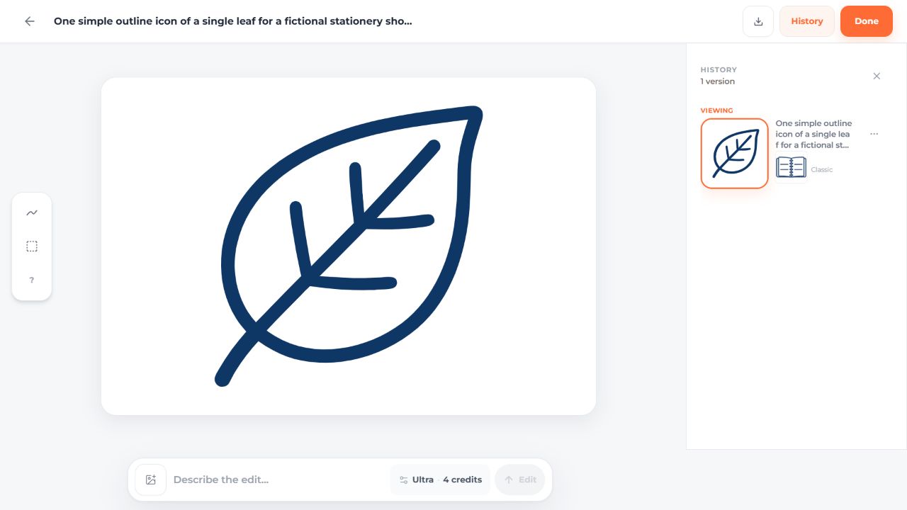
A reference image is useful context for an AI SVG generator, but it is not a hard constraint on the downloaded file. This guide compares an actual reference-guided leaf with a text-only result, then shows where exact source edits fit into a brand workflow.
The examples were made for a fictional stationery project on September 14, 2026. This page replaces earlier unsupported claims about guaranteed consistency, a 47%-to-3% improvement and an 80% reduction in review cycles.
Keep the written brief fixed
The leaf prompt was:
One simple outline icon of a single leaf for a fictional
stationery shop product badge. Square composition with
generous padding, rounded line ends, dark navy #18345F only,
no lettering, no filled background, no gradients or shadows.
Transparent background.
Both leaf generations used Classic, one SVG and a transparent background, at a displayed cost of two credits each. The first had no reference. For the second, the original notebook result was attached through More actions > Add to Prompt. The written leaf prompt stayed unchanged.
These are two individual outputs without repeated trials. Their differences cannot all be attributed to the reference, because generation can vary between attempts.
Inspect the reference as well as the result
The notebook reference itself did not use only the requested navy. Reusing it therefore supplied a visual example with its own imperfections.
| File | Raw bytes | Paths | Fill values |
|---|---|---|---|
| Notebook reference | 23,180 | 21 | Six values, including rgb(16,49,94) |
| Leaf without reference | 3,726 | 1 | rgb(22,49,97) |
| Leaf with notebook reference | 4,674 | 1 | rgb(15,55,102) |



The requested #18345F is rgb(24,52,95). Neither leaf uses that exact value. Both contain one path and no embedded image; their geometry and viewBoxes differ. The measurement file includes the hashes and complete fill lists.
Open both leaves at the same display size. Compare the outer silhouette, stem, veins and spaces inside the outline. Then place them beside the notebook. A reference-guided result still needs that side-by-side judgment.
Make the palette exact when the shape already works
For the original leaf, the manual navy version replaces its fill with #18345F. It also changes proportional fitting to xMidYMid meet, while retaining the original path coordinates.

The notebook and parcel have separate manually finished versions. Their shared navy improves palette consistency, but their complexity and weight still differ. Recoloring is not a substitute for evaluating the drawings together.
Avoid a global regular expression that replaces every color without understanding its purpose. An intentional accent, gradient, transparency or background may need different treatment. Inspect the particular file and keep the original.
Turn the result into a useful style guide
Record the decisions someone else will need:
- The exact final color values.
- The display sizes where each icon remains readable.
- Which original or revision supplied the accepted geometry.
- Which changes were made manually.
- A reference file and the precise wording used with it.
Do not describe an outlined-looking icon as having an adjustable stroke unless the SVG actually uses one. These generated outlines are filled path regions. Adding or changing a stroke-width attribute is a different operation from editing that filled geometry.
The currentColor exercise shows a separate manual adaptation for a button whose icon follows its text color. Use that technique when the interface needs state colors rather than a permanently fixed brand fill.
Check the set in its intended application
The Fieldnote product-page example displays the manually recolored original notebook, leaf and parcel in equal 52-pixel boxes beside labels. It does not use the later reference-guided leaf. This lets you inspect a complete application without confusing which versions were selected.
For smaller controls, the existing matching-icon tutorial includes a different reference-led set and 24-, 32- and 48-pixel comparisons. Keep those older examples separate from this two-output leaf comparison.
A repeatable next step
Start with a small set and a reference you understand. Keep the model, background and written style requirements steady while changing the subject. Compare each downloaded result with the reference, then make exact implementation changes deliberately.
A useful style guide records what was accepted and why. It should not promise that a prompt will enforce every color, curve or spacing value automatically.