Introduction
Flat design is safe. 3D design is bold. But traditionally, the cost of "bold" was "heavy."
If you wanted 3D typography on your website, you had three unpleasant options:
-
Photoshop Route: Design it in Photoshop, export as PNG. Result: 200KB+ file, blurry on Retina displays, no scalability.
-
Blender Route: Create actual 3D in Blender, export as PNG sequence. Result: Even larger files, requires 3D expertise, painful revision process.
-
CSS 3D Route: Use text-shadow and transform properties. Result: Render jank, inconsistent across browsers, performance killer on mobile.
Each approach forces a brutal trade-off: aesthetic impact vs. technical performance.
But with modern svg text generator technology, you no longer have to choose. You can have 3D effects that are fully scalable, code-based, and weigh less than 10KB—while rendering smoothly on every device.
This guide explores 5 cutting-edge 3D text styles you can generate instantly using AI, with technical breakdowns of how each effect works and when to use it.
What is SVG AI?
SVG AI is the world's most powerful AI SVG Generator, enabling designers and developers to create complex visual effects without manual path construction:
- Text to SVG Generator: Describe your 3D effect in natural language, get a finished SVG in 10 seconds.
- Image to SVG AI Generator: Upload reference images of 3D text styles for AI reconstruction.
- Hybrid Mode: Combine image + text for precise control over complex effects.
- AI SVG Maker & Editor: Refine with prompts like "add more depth" or "increase shadow contrast."
Proof: 60,000+ SVGs generated. Multilingual AI understands 50+ languages. Commercial usage rights included on all plans.
Why SVG 3D Effects Beat Traditional Approaches
Before diving into specific techniques, let's understand the technical advantages of path-based 3D effects:
File Size Comparison
| Method | Typical File Size | Scalability |
|---|
| PNG (Photoshop) | 150-500KB | Degrades at 2x |
| WebP (Compressed) | 50-150KB | Degrades at 2x |
| CSS text-shadow | 0KB (runtime) | Perfect, but CPU-heavy |
| SVG Paths | 5-15KB | Perfect, GPU-accelerated |
text-shadow, which requires the browser to:
- Render the text
- Duplicate it for each shadow layer
- Apply blur if present
- Composite everything
- Repeat on every scroll/resize
This creates:
- Layout jank on mobile
- Battery drain
- Cumulative Layout Shift (CLS) issues
SVG paths are pre-rendered geometry. The browser simply paints shapes—no calculation required. Result: butter-smooth scrolling even on low-end devices.
Web Vitals Impact
| Metric | CSS 3D Text | PNG 3D Text | SVG 3D Text |
|---|
| LCP | Fast | Slow (download) | Fast |
| CLS | High (reflow) | None | None |
| INP | Affected | None | None |
| FCP | Fast | Slow | Fast |
The 5 3D Text Effects You Need to Know
Each of these effects has distinct visual characteristics, optimal use cases, and specific prompting strategies.
1. The Retro Extrusion (Synthwave Style)
Visual Characteristics
Think of the Stranger Things title sequence, Blade Runner aesthetics, or 80s VHS covers:
- Face: Shiny gradients (sunset colors), metallic finish
- Sides: Dark solid colors creating depth
- Accent: Horizontal lines or scan effects
- Color Palette: Magenta/cyan/purple gradients against dark backgrounds
Technical Breakdown
The "retro extrusion" effect consists of multiple stacked path layers:
Layer 1: Shadow (offset, blurred edges)
Layer 2-5: Side extrusion layers (progressively offset)
Layer 6: Main face (gradient fill)
Layer 7: Highlight line (optional)
In traditional design, you'd manually create and align each layer. With AI generation, you describe the intent and the system calculates optimal layer placement.
When to Use
- Music event promotions
- Gaming interfaces
- Nostalgic/retro brand campaigns
- Entertainment landing pages
- Podcast cover art
Generation Prompt
"Retro 80s contour text saying '[YOUR TEXT]', deep 3D extrusion, sunset gradient pink to orange, chrome finish, dark purple background, synthwave aesthetic"
Refinement Prompts:
- "Add horizontal scan lines across the text"
- "Increase the depth of extrusion"
- "Add neon glow around edges"
- "Make the chrome more reflective"
Technical Specifications
| Aspect | Recommended Value |
|---|
| Extrusion depth | 15-30px visual equivalent |
| Layer count | 4-8 extrusion layers |
| Gradient angle | 180° (top to bottom) |
| Optimal file size | 8-15KB |
2. The Isometric Stack (Tech Style)
Visual Characteristics
Isometric projection implies precision, engineering, and technological sophistication:
- Perspective: 30° isometric angle
- Appearance: Text that looks like it's built out of blocks
- Shadows: Precise, geometric shadows
- Color Palette: Often monochromatic or limited palette
- Feel: Architectural, technical, modern
Technical Breakdown
Isometric text uses a specific transformation matrix that skews the text at exactly 30° angles:
Front face: Original text paths
Top face: Paths skewed -30° horizontally
Side face: Paths skewed 30° vertically
The mathematical precision is what gives isometric its "engineered" feeling. Human-drawn isometric often looks "off" because the angles aren't exact. AI-generated isometric is mathematically correct.
When to Use
- Tech company branding
- Software product interfaces
- Architecture/engineering firms
- Data visualization headers
- Technical documentation
Generation Prompt
"Isometric 3D text block saying '[YOUR TEXT]', floating letters, architectural style, precise 30-degree angles, soft shadow, minimal color palette"
Refinement Prompts:
- "Make the extrusion taller for more dramatic effect"
- "Add grid lines on the faces"
- "Change to wireframe style"
- "Add subtle gradient on top face"
Technical Specifications
| Aspect | Recommended Value |
|---|
| Isometric angle | 30° (true isometric) |
| Face separation | Clear color differentiation |
| Shadow | 45° cast, soft edge |
| Optimal file size | 10-20KB |
3. The Bubble Inflate (Y2K Style)
Visual Characteristics
The Y2K/2000s aesthetic has made a massive comeback, trending across fashion, design, and digital:
- Shape: Pillowy, inflated letterforms
- Surface: High-gloss reflections, specular highlights
- Edges: Soft, rounded, organic
- Color: Often bright, playful, candy-like
- Feel: Fun, youthful, nostalgic-future
Technical Breakdown
The bubble effect is achieved through careful gradient placement that simulates light hitting a curved surface:
Base: Solid color fill
Gradient 1: Light reflection (top-left quadrant)
Gradient 2: Ambient shadow (bottom-right quadrant)
Highlight: Small white ellipse (specular point)
Edge: Darker stroke for definition
What makes bubble text tricky to create manually is getting the gradients to follow the letter shapes consistently. AI generation handles this automatically.
When to Use
- Fashion and beauty brands
- Youth-focused marketing
- Social media graphics
- Event promotions
- Product launches with playful tone
Generation Prompt
"Inflated 3D bubble letters saying '[YOUR TEXT]', glossy plastic texture, high-gloss reflections, rounded puffy shapes, candy colors, Y2K aesthetic"
Refinement Prompts:
- "Make the letters more puffy and rounded"
- "Add stronger specular highlights"
- "Use iridescent color shift"
- "Make it look like glass"
Technical Specifications
| Aspect | Recommended Value |
|---|
| Roundness | Maximum corner radius |
| Gradient type | Radial (simulates sphere) |
| Highlight position | 10-20% from top-left |
| Optimal file size | 12-25KB |
4. The Layered Sticker (Paper Cutout)
Visual Characteristics
Mimics physical die-cut stickers stacked on a surface:
- Layers: Visible separation between elements
- Shadow: Soft drop shadow suggesting physical lift
- Border: Thick white or colored stroke
- Texture: Flat, matte (not glossy)
- Feel: Handcrafted, tangible, approachable
Technical Breakdown
The sticker effect creates perceived depth through shadow without actual 3D transformation:
Layer 1: Shadow (offset 3-6px, blur 8-12px, black at 20-30% opacity)
Layer 2: Main shape (solid fill)
Layer 3: Inner shape (offset inward)
Layer 4: White border (stroke)
Layer 5: Text face (fill)
The key is the shadow-to-lift ratio. Too much shadow looks like it's floating; too little loses the effect.
When to Use
- Friendly, approachable branding
- Educational content
- DIY and craft businesses
- Children's content
- Casual/informal marketing
Generation Prompt
"Die-cut sticker style 3D text saying '[YOUR TEXT]', thick white border, soft drop shadow, paper cutout effect, layered depth, flat vector style"
Refinement Prompts:
- "Add more layers for increased depth"
- "Make the shadow softer and more diffuse"
- "Add slight rotation for dynamic feel"
- "Create color offset between layers"
Technical Specifications
| Aspect | Recommended Value |
|---|
| Border width | 4-8px |
| Shadow offset | 4-8px |
| Shadow blur | 10-15px |
| Shadow opacity | 20-35% |
| Optimal file size | 8-15KB |
5. The Skeleton Wireframe (Cyberpunk)
Visual Characteristics
Futuristic look showing the "wireframe mesh" structure:
- Structure: Visible line construction
- Glow: Neon edge lighting
- Background: Dark (black or near-black)
- Color: Single neon color (green, cyan, magenta)
- Feel: High-tech, digital, futuristic
Technical Breakdown
Wireframe text reverses the normal solid/stroke relationship:
Layer 1: Outer glow (blurred stroke)
Layer 2: Main wireframe (thin stroke, no fill)
Layer 3: Internal structure lines (thinner strokes)
Layer 4: Node points (small circles at intersections)
The challenge is creating internal structure that looks intentional, not random. AI generation understands letter anatomy and places construction lines meaningfully.
When to Use
- Tech and cybersecurity branding
- Gaming interfaces
- Music/electronic events
- Futuristic product launches
- AR/VR experiences
Generation Prompt
"Wireframe neon 3D text saying '[YOUR TEXT]', glowing green lines, mesh structure visible, cyberpunk aesthetic, dark background, construction lines showing"
Refinement Prompts:
- "Add pulsing glow effect"
- "Show perspective grid extending from text"
- "Make some lines dashed for variety"
- "Add small data nodes at intersections"
Technical Specifications
| Aspect | Recommended Value |
|---|
| Stroke width | 1-2px main, 0.5-1px internal |
| Glow blur | 3-8px |
| Glow opacity | 60-80% |
| Background | #000000 to #0a0a0a |
| Optimal file size | 6-12KB |
Implementation Guide: From SVG to Website
Once you've generated your 3D text, here's how to implement it correctly:
Basic Inline Implementation
<svg viewBox="0 0 500 100" role="img" aria-label="Your Text">
  <title>Your 3D Text Headline</title>
  <!-- Your AI-generated paths here -->
</svg>
Critical Accessibility: Always include role="img" and aria-label so screen readers announce your graphical text correctly.
Responsive Sizing
SVGs scale naturally, but you want to control aspect ratio:
.hero-text-svg {
  width: 100%;
  max-width: 800px;
  height: auto;
}
Animation Enhancement
Add subtle animation without JavaScript:
.hero-text-svg path {
  animation: subtle-pulse 3s ease-in-out infinite;
}

@keyframes subtle-pulse {
  0%, 100% { opacity: 1; }
  50% { opacity: 0.95; }
}
Dark Mode Handling
SVGs can respond to CSS custom properties:
:root {
  --text-3d-color: #FF6B35;
}

@media (prefers-color-scheme: dark) {
  :root {
    --text-3d-color: #FF9F6B;
  }
}
Then in your SVG:
<path fill="var(--text-3d-color)" d="..." />
Why CSS Filters Are Not the Answer
A common alternative approach is using SVG filters (<feGaussianBlur>, <feDropShadow>, <feSpecularLighting>) to create 3D effects. Here's why that's problematic:
SVG filters are calculated on every frame. On a page with scrolling:
| Approach | Scroll FPS (Mobile) |
|---|
| Path-based 3D | 60 FPS |
| Filter-based 3D | 15-30 FPS |
Inconsistent Rendering
Different browsers implement SVG filters differently. Chrome, Firefox, and Safari will render the same filter with visible variations.
Memory Usage
Filters require creating off-screen buffers for each effect pass. Complex filters can consume 50-100MB of GPU memory—catastrophic on mobile.
The Better Way
Effortless Text to SVG Conversion at SVG AI generates the 3D effect as shapes (paths), not as filters. The visual result is identical, but:
- Renders 10-100x faster
- Consistent across all browsers
- Uses minimal memory
- Works offline (no runtime calculation)
1. Optimize Path Count
After generating, check your SVG code. If you see thousands of paths for simple text, ask the AI to simplify:
"Simplify paths, reduce complexity while maintaining 3D effect"
2. Remove Unnecessary Precision
SVG paths often have excessive decimal precision:
<!-- Before -->
<path d="M10.123456789 20.987654321..."/>

<!-- After (acceptable) -->
<path d="M10.12 20.99..."/>
Many SVG optimizers (SVGO, SVGOMG) do this automatically.
3. Consider Lazy Loading
For below-the-fold 3D text:
<img src="3d-text.svg" loading="lazy" alt="Your 3D Text">
SVG files should be cached aggressively:
Cache-Control: public, max-age=31536000, immutable
Frequently Asked Questions
Can I edit the 3D effect after generating?
Yes. The output is standard SVG with editable paths. You can:
- Open in Illustrator/Figma/Inkscape
- Modify colors, positions, sizes
- Add additional effects
- Animate with CSS or JavaScript
What about animated 3D text?
SVG paths can be animated with CSS or SMIL. For complex animations, consider generating keyframes as separate SVGs and morphing between them.
How do I match my brand colors exactly?
Include hex codes in your prompt:
"3D bubble text in brand colors #FF6B35 and #1A365D"
Or refine after generation:
"Change the main color to #FF6B35"
Can I use these for print?
Absolutely. SVG scales to any resolution. For print, export at your required DPI—the quality will be perfect regardless.
What about non-Latin alphabets?
The AI supports text in 50+ languages, including:
- Cyrillic
- Chinese characters
- Japanese (Hiragana, Katakana, Kanji)
- Arabic
- Hebrew
- Korean
Prompt in your native language for best results.
Conclusion
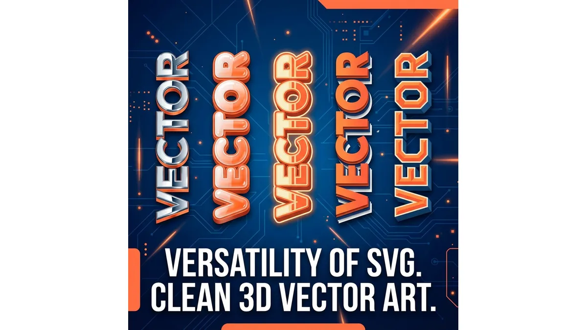
3D text doesn't have to break your performance budget. By using AI to bake 3D geometry into lightweight paths, you can add depth and dimension while keeping your site lightning fast.
The five effects covered in this guide—Retro Extrusion, Isometric Stack, Bubble Inflate, Layered Sticker, and Skeleton Wireframe—represent the most impactful and versatile 3D text styles in modern design. Each has specific use cases, and now you have the technical understanding to implement them correctly.
Stop using heavy PNGs that pixelate on Retina displays. Stop relying on CSS text-shadows that kill mobile performance. Start using text to svg ai that produces Production Ready code optimized for the modern web.
Related Reading: