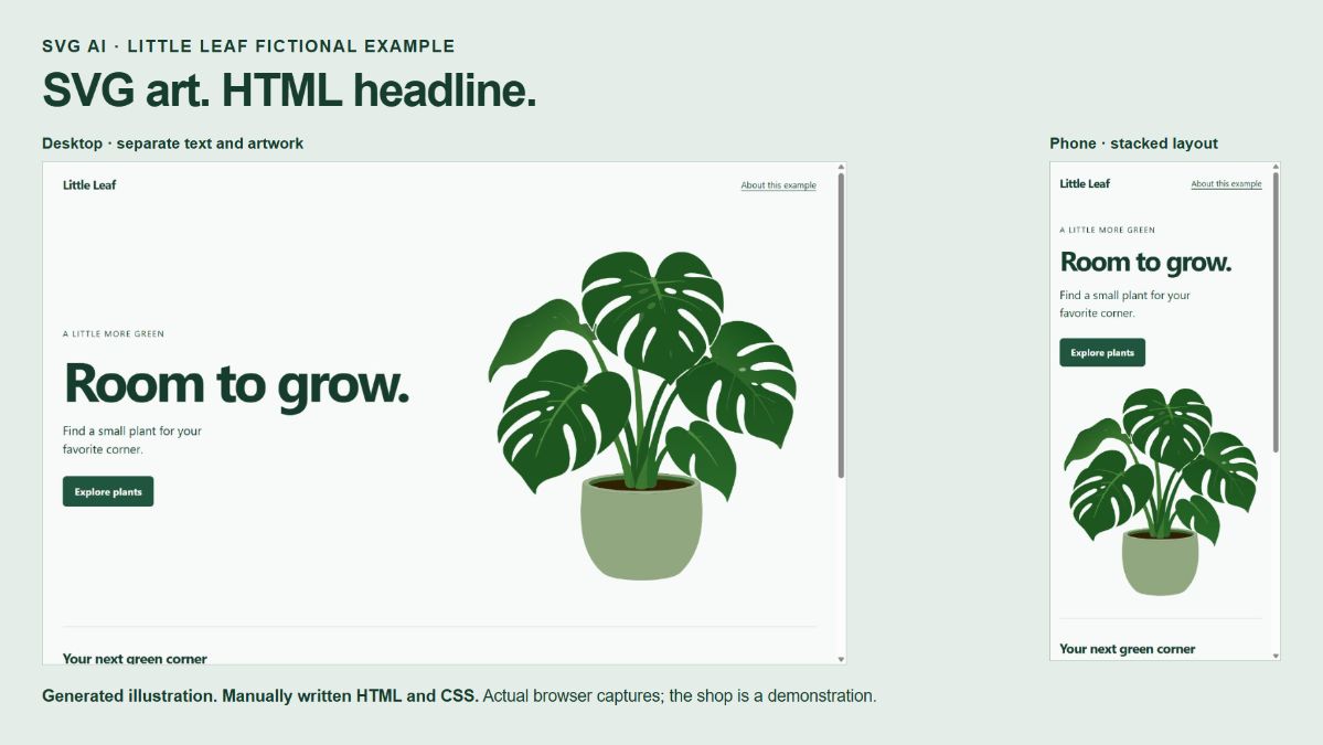
Give the headline its own column and let the illustration occupy the space beside it. That keeps the words editable, gives the artwork a predictable size, and lets the two stack when the screen gets narrow.
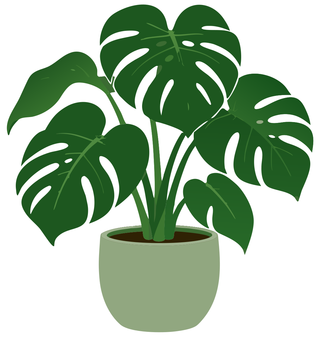
This example uses a potted plant made in SVG AI for Little Leaf, a fictional plant shop. The webpage and responsive layout are written manually in HTML and CSS.
Open the complete hero example, compare the two SVG versions, or download the example files.
Watch the layout come together
The walkthrough shows the finished desktop and phone layouts, the generated illustration, and the HTML/CSS decisions that give the headline its own space.
Watch the tutorial on YouTube.
Start with the words and the space they need
The sample headline is “Room to grow.” A short sentence and an “Explore plants” link sit underneath it. These are ordinary HTML elements, so the wording can change without regenerating the plant.
Keep that separation when adapting the example. A long heading needs more room than a short one. If your copy occupies most of a narrow screen, move the illustration below it instead of shrinking both until they are difficult to read. Keeping important text in markup also makes it selectable and available to assistive technology; web.dev explains that approach.
For the illustration, the brief was one complete potted plant with clear leaves, enough padding around its edges and no lettering. The empty space for the headline comes from the page layout. It does not depend on generating a perfectly blank half of an image.
Generate the illustration
The September 26, 2026 example used Ultra, 1 SVG and Transparent On in SVG AI. The generation used four credits. Check the options and cost displayed in your own composer, and check your account's download access before starting.
The exact prompt was:
A simple flat vector illustration of one healthy potted monstera plant for an owned fictional plant shop called Little Leaf. Illustration only, not a webpage or mockup. Show one upright plant with a few broad, clearly separated green leaves and a simple rounded pot. Use deep forest green leaves, a muted green pot, and no tiny decorative details. Keep the whole plant and pot inside the canvas with comfortable padding. Transparent background. No words, letters, logo, price, frame, shadow, gradient, texture, or other objects.
The result is a green plant in a rounded green pot. It also contains gradients: the exported SVG has five linear-gradient definitions, despite the request for none. They are retained in this example. If your project requires only solid fills, that would need a separate edit and another visual check.
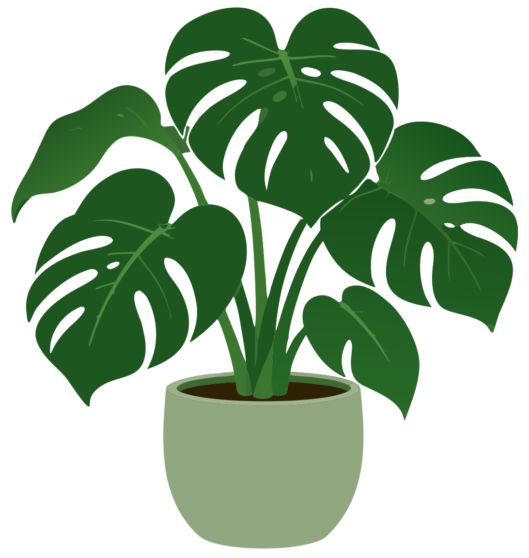
No AI edit was used for this illustration. Save the original export before changing any source attributes; the complete original SVG is included in the download.
Make a small, explicit scaling adjustment
The original SVG begins with these sizing attributes:
The viewBox, dimensions, path coordinates and paint values stay the same. This edit does not redraw the plant or flatten its gradients.
An SVG's viewBox describes the rectangle of its own coordinate space that maps into the image viewport. It is separate from the browser's viewport. With xMidYMid meet, the SVG fits that rectangle proportionally and centers it. See MDN's viewBox reference and preserveAspectRatio reference for the attribute behavior.
The hero's CSS already keeps the image's height proportional to its width. The manual SVG setting also specifies what should happen if you later place it in a differently shaped viewport. The comparison page includes both the original proportions and deliberately wide containers so you can inspect that distinction.
Put the image beside real HTML text
The complete download includes the page styling. The core structure is small:
<section class="hero" aria-labelledby="hero-title">
  <div class="hero-copy">
    <h1 id="hero-title">Room to grow.</h1>
    <p>Find a small plant for your favorite corner.</p>
    <a href="#sample-collection">Explore plants</a>
  </div>
  <div class="hero-art">
    <img
      src="assets/little-leaf-proportional.svg"
      width="1092"
      height="1152"
      alt=""
    >
  </div>
</section>
Here is the layout rule, separated from the colors and typography:
The default is one column: copy first, then the illustration. At 50rem, the grid allocates separate columns, with slightly more space for the words. Change that breakpoint when your own copy and artwork need a different amount of room; it is a choice for this example, not a property of SVG.
The image can shrink to its container and stops growing at 32rem. Automatic height follows its proportions. There is no background-image crop and no fixed hero height that forces a longer heading into the artwork.
The plant is decorative in this fictional shop: it sets the mood but does not add information needed to understand the heading or link. That is why the image uses alt="". If a replacement illustration communicates information, give it a useful description instead. The W3C decorative-image guide explains that decision.
Adapt the finished example
Extract the download and open index.html. The CSS, both SVG versions and the actual prompt are included, with relative file paths that work locally. The “Explore plants” link leads to a labeled sample section; replace it with a real destination when using the component in your own site.
Change the heading and paragraph, then inspect the page at a narrow phone width and a desktop width. Increase browser zoom, follow the link with a keyboard and look at the plant's outer leaves and pot. Keep enough space for the content that actually matters. If the drawing contains details that disappear at its intended size, make a separate simplified version and compare it with the original.
The two sources remain separate in the download: the untouched generation and the single-attribute manual finish. Use the original if you want a different treatment. For a broader project with a logo, hero and supporting artwork, the FlowMint SVG creation walkthrough shows how those assets can share a visual direction.
 No AI edit was used for this illustration. Save the original export before changing any source attributes; the complete original SVG is included in the download.