AI SVG Creation Workflow: Build a SaaS Landing Page
By Ashesh Dhakal, Founder, SVG AI
ai svg generatorai svg generator for designersai svg workflowai svg generationeditable svgsvg ai
An AI SVG creation project works best when the assets share a visual direction. Start with a logo, reuse it as a reference for supporting artwork, and place the results together in a page before refining the details.
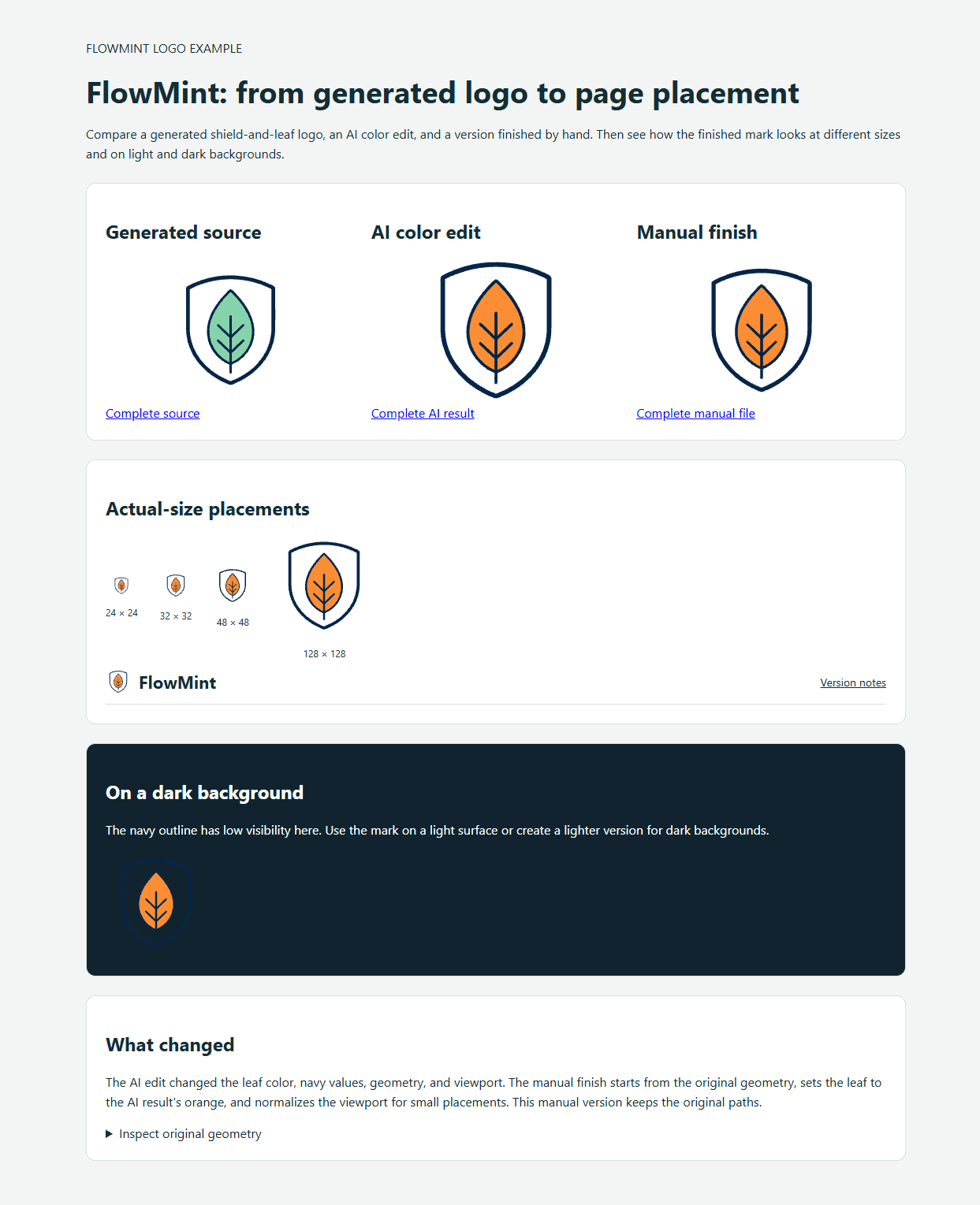
About the project. FlowMint is a fictional finance dashboard. The landing-page walkthrough was created on May 23, 2026. A separate shield-and-leaf logo example from September 5 shows the original SVG, an AI revision, and a manual finish you can download and compare.
The aim is to make a brand mark, marketing illustration, UI icons, and empty state feel like part of the same product. For an introduction to the tools and file format, see the AI SVG generation guide.
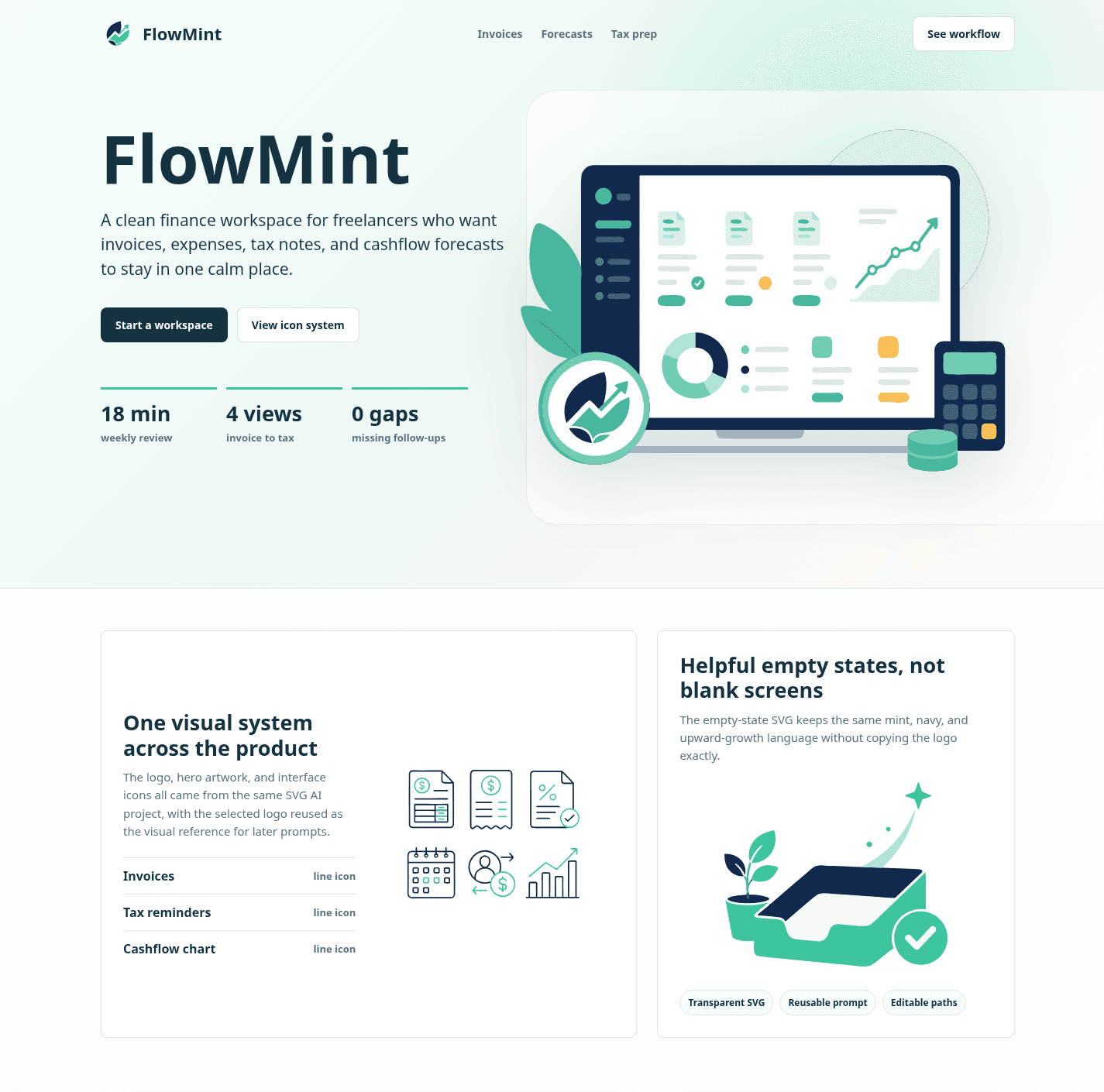
Here is the finished page mockup built from the generated SVG assets:
Refine a logo and use it in a page
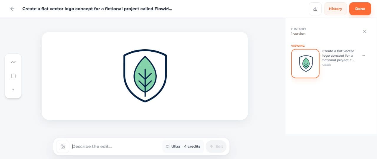
The September logo example used Classic, one SVG, 1:1 ratio, and the transparent-background option. The prompt was:
Create a flat vector logo concept for a fictional project called FlowMint,
symbol only with no lettering. A single rounded shield containing one simple
leaf, centered with generous padding. Dark navy outlines and a mint green leaf
on a white background. No gradients, no shadows, no mockup, no tiny details.
The prompt asked for white while the background setting requested transparency. Keep those instructions consistent in your own brief. This SVG has three paths and no embedded image or full-canvas background shape.
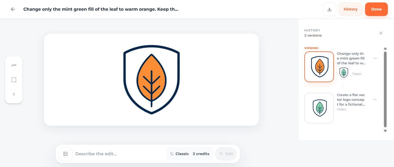
The next request was a Classic AI edit:
Change only the mint green fill of the leaf to warm orange. Keep the navy
shield, navy leaf veins, composition, shape and size unchanged.
The leaf became orange. The navy changed slightly, and the shield, leaf geometry, and framing also changed. The edit achieved the color direction but did not preserve everything else exactly. Both complete files are available so you can compare the actual result:
| Version | Complete file | What it represents |
|---|---|---|
| Generated source | FlowMint original SVG | Navy shield with a mint leaf |
| AI revision | FlowMint AI-edited SVG | Orange leaf, with changes to the navy, shapes, and framing |
| Manual finish | FlowMint manual-finish SVG | Original geometry, exact orange replacement, adjusted viewport |
| Page example | Open the responsive logo comparison | All three versions at several sizes and in a page header |



The Manual Finish Is A Separate Decision
The manual color change starts from the original SVG in code. The manual version replaces mint rgb(133,211,171) with orange rgb(251,142,52) and preserves every path coordinate and the original navy. It also sets preserveAspectRatio="xMidYMid meet" and changes the viewBox to 120 112 1820 1820 to add balanced padding in a square placement.
Compare the mark at 24, 32, 48, and 128 pixels in the page example. At 24px the interior looks dense; the 32px light header gives it more room. The navy shield is hard to see against a dark background, so use a light surface or make a separate light-colored version for dark themes.
You can create the first SVG for your project with starter credits after signing up. The composer shows the credit cost before generation. SVG downloads require paid access through an eligible subscription or credit purchase.
The Workflow At A Glance
The fictional product is FlowMint, a finance dashboard for freelancers. The brand rules were intentionally simple:
| Brand rule | Choice |
|---|---|
| Palette | Deep navy, mint green, soft aqua, warm amber |
| Shape language | Rounded SaaS geometry |
| Output type | Transparent editable SVG assets |
| Constraint | No text inside generated SVGs |
| Final use | A landing page with logo, hero, icons, and empty state |
The dashboard workflow was:
- Create one project for the whole asset family.
- Generate four logo mark options.
- Choose the clearest logo as the visual anchor.
- Use that logo as a reference for the hero illustration, icon set, and empty state.
- Download the SVG files.
- Put them into a real landing page layout.
- Review what is production-ready and what needs cleanup.
That sequence matters. If you generate each asset in isolation, the results may look fine separately and messy together. A designer workflow should create continuity, not just individual images.
Step 1: Create One Project For The Asset System
The May walkthrough starts in a project named FlowMint designer workflow - May 23.
Keeping everything in one project gives you three practical advantages:
| Advantage | Why it matters |
|---|---|
| Shared context | You can quickly reuse previous assets as references. |
| Easier review | Logo, hero, icons, and empty states stay visible in one place. |
| Better documentation | The project itself becomes a record of prompts and decisions. |
The screenshots show the SVG AI dashboard used to generate these assets.
This is also a good place to set your designer constraints before generating anything. Do not start with "make me a SaaS logo" and hope the system guesses the brand. Write down the rules first.
For FlowMint, the reusable style lock was:
Deep navy and mint green palette, rounded geometric SaaS style, clean vector shapes, transparent background, no text, no letters, editable SVG style.
That line appears in different forms throughout the prompts below.
Step 2: Generate A Logo Anchor First
The logo is not just a deliverable. In this workflow, it becomes the style anchor for the rest of the page.
The logo prompt was:
A clean vector brand mark for FlowMint, a fictional finance dashboard for freelancers. Abstract mint leaf formed from an upward cashflow line, simple geometric SaaS logo mark, deep navy and mint green palette, rounded shapes, transparent background, no text, no letters, editable SVG style.
The example generated 4 SVGs with Classic mode to compare different logo directions. The screenshot below shows the May 2026 interface; use the cost displayed in your own composer when choosing how many variations to generate.
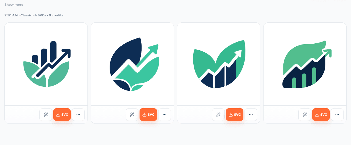
The selected anchor supplied a simple visual direction for the rest of the asset family.
| Evaluation check | Selected feature |
|---|---|
| Recognizable idea | Leaf plus upward finance line |
| Simple silhouette | Works as a small header logo |
| Color discipline | Navy and mint stayed clear |
| Reuse potential | Could appear as a small badge inside hero art |
| Editability | Clean shapes, not overdecorated |
The second logo option was the strongest anchor for this workflow. It had enough personality to guide the later prompts without being too complex.
Step 3: Reuse The Logo As A Reference
The selected logo was then reused as a reference for the other assets.
This is the most important designer move in the workflow. A prompt describes intent, but a reference shows the visual language.
| Asset | Reference used? | Why |
|---|---|---|
| Hero illustration | Yes | To echo the logo mark and palette inside the dashboard scene. |
| Feature icon set | Yes | To keep the icons in the same navy and mint system. |
| Empty state | Yes | To preserve the upward-growth motif without copying the logo exactly. |
If you are building assets for a product page, use references after you have a strong direction. Use text-only prompts for exploration. Use reference-guided prompts for consistency.
Step 4: Generate The Hero Illustration
The landing page needed a hero image that looked like a finance dashboard, not a random abstract SVG.
Here was the prompt:
Flat vector SVG hero illustration for FlowMint, a freelancer finance dashboard. Show a laptop dashboard with invoice cards, a mint leaf coin, an upward revenue line, and small organized finance widgets. Deep navy, mint green, soft aqua, warm amber accent. Clean rounded SaaS illustration, transparent background, no text, no logos.
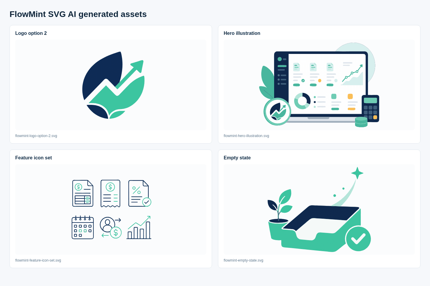
The hero step used one SVG variation with the logo as its reference. The result picked up the dashboard, mint palette, upward chart, and the logo-like badge in the lower-left area.
That is a useful example of what references are good at: they can carry visual memory from one asset into another without needing the same words repeated forever.
Step 5: Generate A Matching Feature Icon Set
The next asset was a six-icon set for product sections: invoices, expenses, tax, calendar, client payments, and analytics.
Prompt:
Create a matching set of six simple SVG line icons for FlowMint in a 3x2 grid: invoices, expenses, tax, calendar, client payments, analytics. Rounded 2px stroke, deep navy outlines with mint accents, consistent spacing, simple geometric shapes, transparent background, no text.
For individual UI controls, split the generated sheet into separate files and check each icon's viewBox. For a landing page design pass, a single icon sheet is enough to test the style in context.
These details gave the icon set a shared direction:
| Prompt detail | Effect |
|---|---|
| Six named icons | Defined the subjects needed for the page. |
| 3x2 grid | Made the set easy to inspect as a family. |
| Rounded 2px stroke | Gave the generator a repeatable icon rule. |
| Navy outlines with mint accents | Kept the icon set tied to the logo. |
| No text | Avoided unreadable pseudo-labels inside the SVG. |
Step 6: Generate A Product Empty State
Most landing pages need more than logos and hero art. Product screenshots, onboarding screens, and dashboard states need supporting illustrations too.
The empty-state prompt was:
Friendly empty-state SVG illustration for FlowMint: tidy invoice tray, small mint plant, checkmark coin, and a soft upward spark. Clean SaaS vector style, deep navy and mint palette, rounded shapes, transparent background, no text.
This produced a simple product-state illustration that still belonged to the same system.
Here is the generated asset sheet: selected logo, hero illustration, icon set, and empty state.
Step 7: Put The SVGs Into A Real Page
This is the step many AI design workflows skip. They show individual generations, but never ask whether the assets work together in a layout.
The landing-page mockup uses these generated files:
| Page area | SVG asset used |
|---|---|
| Header brand | flowmint-logo-option-2.svg |
| Hero artwork | flowmint-hero-illustration.svg |
| Product feature section | flowmint-feature-icon-set.svg |
| Empty-state section | flowmint-empty-state.svg |
The mockup made two things obvious:
- The hero illustration and logo worked together better than they looked alone.
- The icon set was useful, but it should be split into individual SVG files before production.
That is why the final layout matters. Designers should judge AI-generated SVGs in the environment where they will actually live.
What Worked Well
The May landing-page mockup brings the logo, illustration, icons, and empty state into a related visual system. Its shared palette and reference image helped connect the assets.
| Result | What worked |
|---|---|
| Logo | Clear finance-growth metaphor, simple enough for header use. |
| Hero illustration | Matched the dashboard theme and reused the logo language. |
| Feature icons | Consistent line style, useful finance subjects, simple colors. |
| Empty state | Friendly, on-brand, and distinct from the hero image. |
| Final page | Assets felt related when assembled together. |
The selected logo gave the later prompts a visible style target. This walkthrough did not isolate the reference effect in a controlled comparison.
Further refinements for a finished product
The landing-page mockup establishes a visual direction. These are the remaining refinements for the full asset set:
| Asset | Production cleanup |
|---|---|
| Logo | Test at favicon size and remove any unnecessary paths. |
| Hero | Normalize the badge placement and make sure the dashboard details remain readable at responsive sizes. |
| Icon set | Split into individual icons, align viewBoxes, and standardize stroke widths. |
| Empty state | Tune the tray silhouette and simplify any dense path groups. |
| Whole page | Optimize the SVGs after checking their appearance, then compare the optimized versions. |
This is the right mental model for an AI SVG generator: it can compress exploration and execution, but it does not remove design judgment.
Prompt Pattern For Designer Workflows
If you want to repeat this process for your own product, use this structure:
[Asset type] for [brand/product], a [category] for [audience].
Show [specific subject or metaphor].
Use [palette], [shape language], [style], [background rule].
Avoid [text, letters, logos, clutter, raster texture].
Make it [editable SVG use case].
Examples:
| Asset | Prompt angle |
|---|---|
| Logo | Name the metaphor and forbid text or letters. |
| Hero | Name the product scene and the UI objects. |
| Icon set | Name the exact icons and shared stroke rules. |
| Empty state | Name the product state and emotional tone. |
| Social preview | Name the composition and leave text to HTML/CSS. |
For more prompt fundamentals, see the text to SVG AI tutorial. If you are comparing tool categories, use the best AI SVG generators comparison as a broader reference.
A Designer Checklist For AI SVG Generation
Before using the assets in your page, review them together:
| Check | Question |
|---|---|
| Intent | Does the SVG communicate the requested idea quickly? |
| System fit | Does it belong with the other assets? |
| Small-size use | Does it survive at header, icon, or mobile sizes? |
| Background | Is the background transparent if the design needs to be reused? |
| SVG reality | Does the file contain vector markup instead of one embedded raster image? |
| Edit path | Can you refine it without regenerating from scratch? |
| Naming | Are the downloaded files named for their use, not just their prompt? |
For icons specifically, read the AI-generated SVG icons guide. For logos, the SVG logo generator guide gives a more focused startup-logo workflow.
Keep a reusable project folder
Save the brief and prompts beside the original SVGs, AI revisions, and manually finished files. Use names that describe each asset's role, such as header-logo.svg or invoice-empty-state.svg, and include a screenshot of the final page.
A short README should explain which version to use, which backgrounds it suits, and any remaining size or contrast limitations. This makes the project easier to update or hand to another designer.
FAQ
Is an AI SVG generator useful for real design workflows?
Yes, when it is used as a fast concept and asset-generation layer. The designer still chooses the style direction, writes constraints, reuses references, reviews the SVGs, and polishes the final system.
How do designers keep AI SVG assets on brand?
Keep all assets in one project, use one selected result as a reference, repeat the same color and style rules, and judge the outputs together in the final layout instead of one by one.
Should I generate one SVG or four SVGs?
Generate four SVGs when choosing a logo, style anchor, or first visual direction. Generate one SVG when you already have the reference and only need a specific supporting asset.
Are AI-generated SVGs editable?
They should be inspected before production. Look for real SVG elements such as path, circle, rect, polygon, and line, and watch out for raster images embedded inside an SVG wrapper.
What should I keep with the finished SVG files?
Keep the brief, prompts, original SVGs, revisions, and final files together. Add a short note describing manual changes and where each asset belongs in the page.