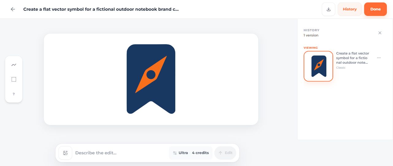
The Fieldnote brief called for a bookmark and compass, two colors, and no lettering. The first result supplied that visual idea, but its exported colors were different from the requested values. An AI recolor later changed the geometry too.
This project shows where an AI SVG logo generator fits in a complete workflow: describe the concept, inspect the actual download, choose a revision method and prepare the versions you need. Fieldnote is a fictional notebook brand created for these examples, not a customer success story.
Write a brief you can check
Decide the subject, intended placement, palette and exclusions. For Fieldnote, the bookmark connects to notebooks and the compass supplies an outdoor motif. The initial symbol was intended for a website layout, with separate name treatment considered later.
The exact prompt was:
Create a flat vector symbol for a fictional outdoor notebook brand called
Fieldnote. A dark navy rounded bookmark shape containing one simple orange
compass needle. Center it with generous padding. Use only navy #18345F and
orange #F97316. No lettering, no gradients, no shadows, no texture, no mockup.
Transparent background.
The color codes are requirements to verify, not a guarantee that every exported fill will match them.
Generate a candidate and keep the original
On September 14, 2026, the dashboard used Classic, one SVG and a transparent background. The generation displayed two credits.
The original download contains three paths, no image elements and no text elements. Its 2,552 bytes include navy rgb(24,56,98) and orange rgb(247,111,27), rather than the requested #18345F and #F97316.
Save the untouched file before making changes. A screenshot documents what appeared in the editor; the full SVG lets you inspect its geometry, fills and framing.
Compare directions against the same use
Two later generations explored an F/N monogram and a full Fieldnote wordmark. Each used Classic, one SVG, transparency and no reference, at two displayed credits. They are separate concepts for the same fictional brand, not a controlled style benchmark.
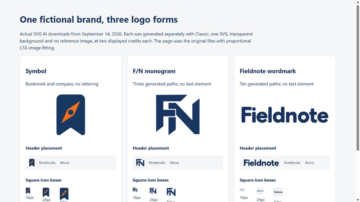 The working comparison shows the symbol, initials and full name in actual placements. The wordmark communicates the name in the header; the compact forms occupy more of a small square. The symbol remains the relevant choice for the original no-lettering brief.
Use the monogram-versus-wordmark walkthrough for those exact prompts and file measurements. There was no audience-recognition test, so the examples do not establish a universal winning form.
The working comparison shows the symbol, initials and full name in actual placements. The wordmark communicates the name in the header; the compact forms occupy more of a small square. The symbol remains the relevant choice for the original no-lettering brief.
Use the monogram-versus-wordmark walkthrough for those exact prompts and file measurements. There was no audience-recognition test, so the examples do not establish a universal winning form.
Choose between visual refinement and an exact source edit
The bookmark's AI edit requested teal #0F766E for the orange needle while retaining everything else. The result used #118B81, changed the navy and altered the paths and viewBox.
That result is useful to inspect, but it does not meet an exact fill-only requirement. The manual brand-color version starts from the original, sets the requested navy/orange values and uses proportional fitting. The manual teal version uses the same original paths with navy/teal fills.
The five-check tutorial explains the original, AI revision and manual versions in detail. Keep their filenames distinct so a future edit starts from the intended geometry.
Prepare versions for real placements
For the website example, use the manual brand-color symbol on a light surface. Check its appearance at the actual display size. A proportional viewBox does not make every interior detail readable in a tiny icon.
The light/dark exercise supplies a white-and-orange version for dark backgrounds. The simplification exercise removes details from the same symbol and compares the result at small sizes.
For a social platform that accepts a raster image, export the chosen version at the required pixel dimensions and inspect the saved image. For print or physical production, confirm the recipient's formats, dimensions and color requirements. The browser examples here do not verify those downstream processes.
Download the complete Fieldnote example
Download the nine-file logo package. It contains:
- The three original generated logo forms.
- Three clearly labeled manual symbol variants.
- The working header/icon comparison and its file measurements.
- A README identifying the originals, modifications and intended use.
Extract the files together, then open logo-form-comparison.html. Its relative links need the original SVGs alongside it.
This owned example replaces the earlier page's five unsubstantiated “real-world” case studies and outdated vendor-price table. The package makes the actual work inspectable without inventing customer outcomes.
Resolve the specific problem you find
If the color is wrong but the shape works, change the fill deliberately. If lettering is wrong, inspect every character and consider setting editable text separately. If a detail disappears at small size, make a simplified variant rather than assuming a larger preview proves readability.
The generated wordmark has ten paths and zero text elements. It is an outlined visual concept; changing the name requires geometry editing or a separate editable text source.
Keep the project reusable
Save the brief, original output, AI revisions and manual finishes together. Note which file belongs in each placement. Optimize a copy only after the appearance is accepted; the logo optimization guide provides measured files and a reproducible configuration.
Check current generation and export access before your own run. These examples used existing account access and report displayed credits, not a promise of unlimited free downloads. The finished logo is the selected, checked file, not simply the first preview.