Simplify an SVG Logo: Remove Details and Compare Real Sizes
By Ashesh Dhakal, Founder, SVG AI
svgsvg tutorialminimalist svg logo design
A small logo can lose its most distinctive detail before the whole shape looks blurry. In the Fieldnote example, the tiny circular center is easy to see in the large preview and much less useful in the smallest render. Removing it changes the mark; removing the entire compass changes its meaning as well.
This exercise starts with one fictional notebook mark from the SVG logo generator. It compares deliberate manual reductions of that same file, so the differences are easy to trace.
Start with the actual generated mark
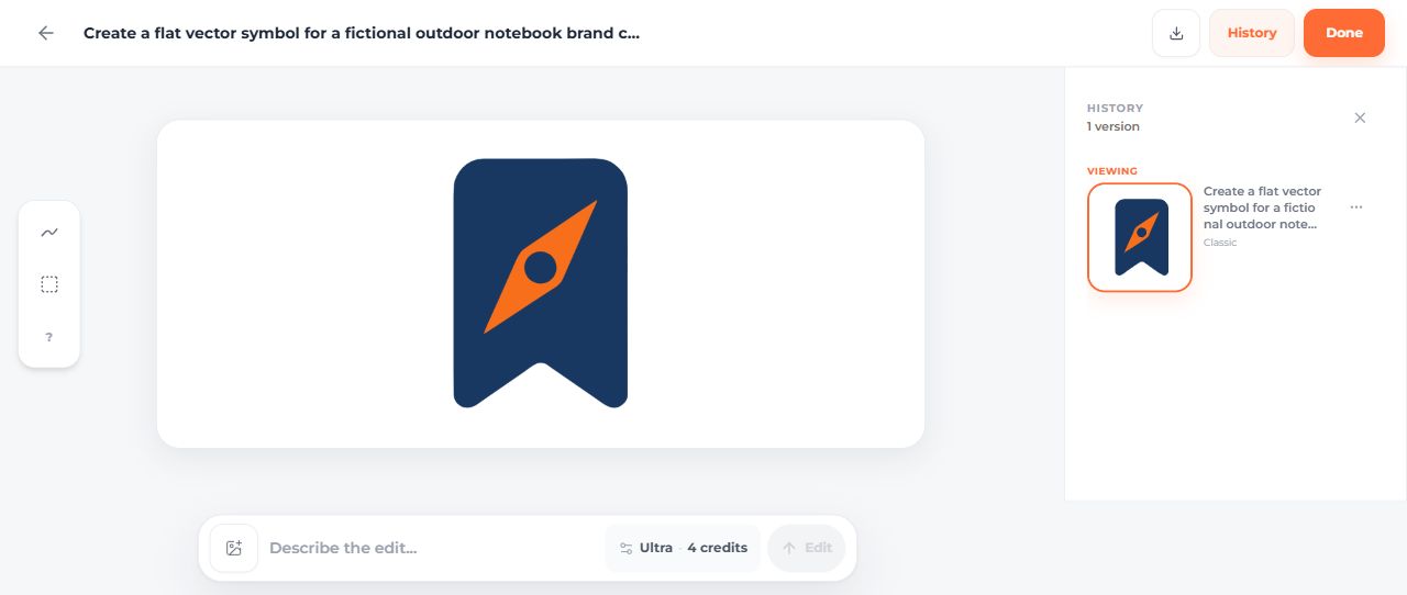
The September 14 dashboard generation used Classic, one SVG and a transparent background, at a displayed cost of two credits. The prompt asked for a navy rounded bookmark containing an orange compass needle, without lettering, gradients or shadows.
Download the untouched original. It contains three paths: the bookmark, the orange needle and the navy center detail. Before the reduction exercise, the manual brand file sets the requested navy/orange fills and proportional fitting. Those are manual changes, not a second AI generation.

Remove one detail at a time
The first manual version keeps all three paths. The second version removes the center path. The third version also removes the needle, leaving the bookmark silhouette.



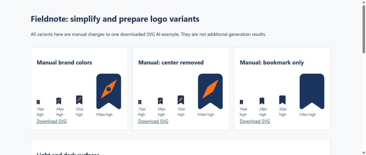
Open the working comparison at normal browser zoom. Each version appears at 16, 24, 32 and 128 pixels high. These are CSS heights, not square icon dimensions.
At 16 pixels high, the compass center becomes a small dark spot. Removing it leaves a more continuous orange shape. Removing the needle makes the silhouette simpler again, but also removes the outdoor-compass idea. The simplest file is not automatically the best choice for this fictional brand.
For your own mark, keep an unchanged copy, remove one identified element, and put the versions beside each other at the smallest intended size. If deleting a detail breaks another shape, undo the change and inspect how the paths overlap. A path count is useful for describing this example, not a universal target for good logos.
Choose a version for a specific placement
| Placement | What this example suggests checking |
|---|---|
| Small navigation mark | Whether the needle is still distinguishable beside the label |
| Larger brand presentation | Whether the center detail contributes to the compass idea |
| Plain bookmark action | Whether the simple silhouette or a standard library icon communicates the action more directly |
These are design judgments to test in your interface. This exercise did not measure recognition with users or compare brand performance. Keep a visible label where the symbol's meaning may be unclear.
Keep reduction separate from optimization
Deleting the compass redesigns the mark. Running an optimizer should aim to preserve the chosen design while reducing redundant file data. Use the measured logo optimization walkthrough for that separate task.
Background also matters. The navy shape loses separation on a navy surface even when the silhouette is simple. The light, dark and single-color logo guide prepares variants for those placements.
Keep the original, your selected small-size variant and the larger version together. Name them by their intended use and include the comparison in the handoff to whoever places the logo. A smaller-looking mark in a large preview is not evidence that it works in the final layout.