This guide covers the work after generation: preserve the source, inspect the geometry, normalize color deliberately, render a reusable icon, and test the result at its real size. For creating a matching set from prompts, use the matching-icon tutorial.
I built SVG AI. This guide uses six earlier icon examples, with fills manually changed to currentColor so they can inherit a page's CSS color. We checked their file structure and rendering on September 5, 2026. The component work below happens after generation; raw outputs may need these adjustments.
What it means to "generate SVG icons with AI" in 2026
An AI generator creates a new icon concept from a prompt or reference. An icon library provides an existing design, and a vectorizer traces an existing image. Choose the method that fits the asset before starting implementation.
For common metaphors, Iconify, Icons8, Iconscout, SVG Repo, The Noun Project, and Flaticon provide searchable libraries with their own licenses. For a custom concept, use the svg icon generator. For faithful conversion of an owned image, use the existing image to SVG converter.
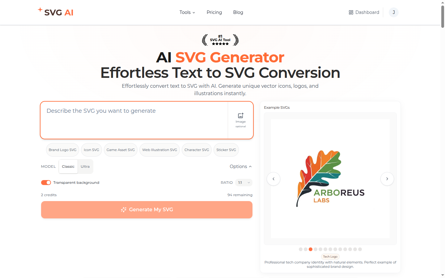
The SVG AI homepage accepts a description and reference context. Check the chosen model, output count, and displayed credit estimate before generating. Sign up to get starter credits. SVG export requires paid access through an eligible subscription or credit purchase.
 Manual finishing can use Inkscape or Figma; check the imported geometry and the receiving application.
Six complete icon files and their implementation
The six icons below cover search, shopping, profile, settings, favorites, and notifications. These are prepared SVGs with currentColor fills; download the individual files or use the combined sprite later in this section.
Each file contains vector paths without an embedded raster image. File sizes range from 874 bytes for the magnifying glass to 6,753 bytes for the gear. All six use a 2048-unit viewBox; set their displayed size without changing that coordinate system.
Download the complete six-icon sprite and open the interactive icon example. We manually combined the six SVGs into a sprite while preserving their path data and viewBox, so each icon can be reused by its symbol ID.
Compare icons at 24px, 32px, and 48px
The example displays each icon at 24px, 32px, and 48px, with a light/dark theme toggle. In Chromium, all six inherited the selected theme color at each size. Their generous internal margins and fine outlines look weak at 24px, especially in the gear, so a compact interface would benefit from simpler shapes or smaller margins.
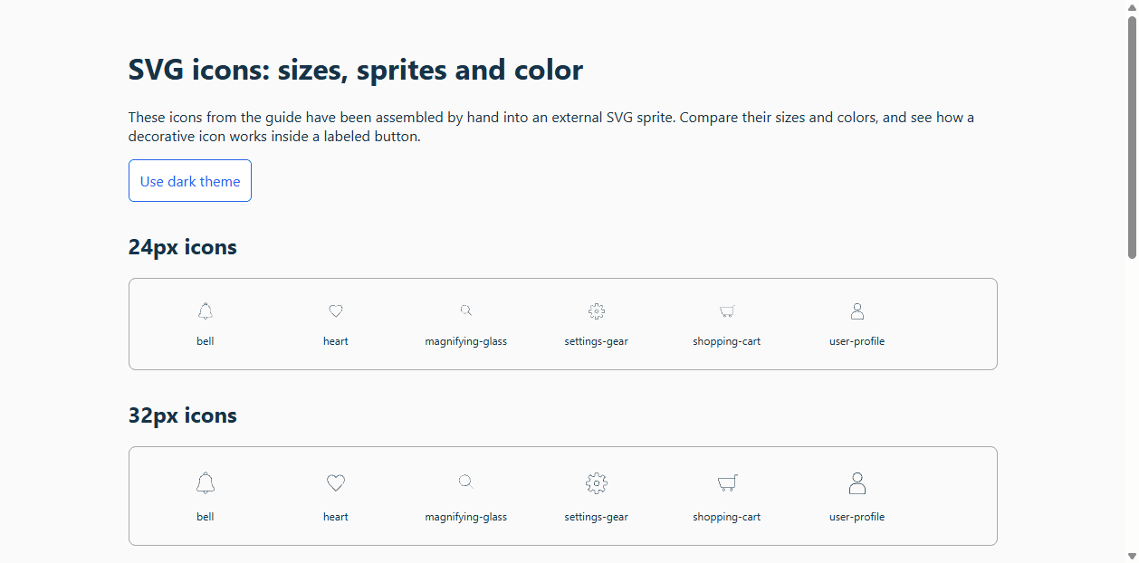
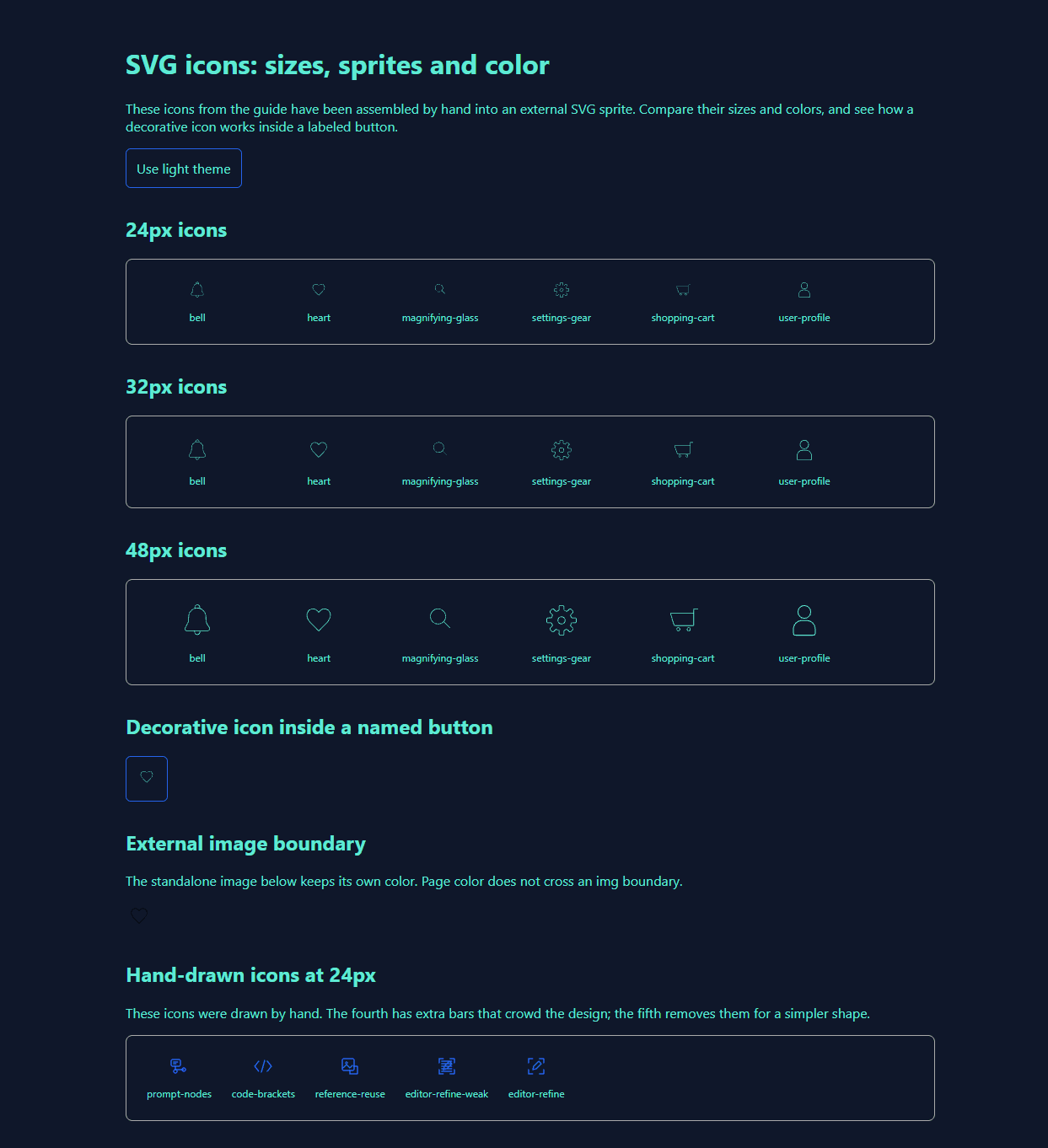 Compare the drawn bounds and visual weight, not only the outer SVG dimensions. For a 24px interface, simplify the gear or use a purpose-drawn small-size variant before shipping.
The developer's rubric for a good SVG icon
Use this sequence when turning an output into a component:
- Preserve the source. Save the original exported file before editing attributes or paths.
- Keep the correct viewBox. Changing
2048 2048 to 24 24 without transforming the geometry clips the design. Set the rendered width/height independently.
- Normalize colors deliberately. For a monochrome icon, change the intended fills or strokes to
currentColor. Keep none, gradients, and multicolor regions when they serve the design.
- Check actual-size geometry. Match drawn bounds, apparent stroke weight, and alignment at the intended size. A viewBox alone does not enforce a pixel grid.
- Name the use, not just the picture. Decorative icons are hidden from assistive technology; a standalone informative icon needs a meaningful accessible name.
- Optimize after checking the design. More paths are not automatically a defect. Optimize a copy and compare it with the original.
A complete React integration
Place the downloaded sprite at public/icons-sprite.svg. This component uses the actual heart symbol in that file; it does not rely on an implicit SVG loader.
import { useId } from "react";

type HeartIconProps = {
  label?: string;
  size?: number;
  className?: string;
};

export function HeartIcon({ label, size = 24, className }: HeartIconProps) {
  const titleId = useId();
  return (
    <svg
      viewBox="0 0 2048 2048"
      width={size}
      height={size}
      className={className}
      role={label ? "img" : undefined}
      aria-hidden={label ? undefined : true}
      aria-labelledby={label ? titleId : undefined}
      focusable="false"
    >
      {label ? <title id={titleId}>{label}</title> : null}
      <use href="/icons-sprite.svg#heart" />
    </svg>
  );
}

export function FavoriteButton() {
  return (
    <button type="button" aria-label="Add to favorites" className="favorite">
      <HeartIcon />
    </button>
  );
}
.favorite { color: #2563eb; }
.favorite:hover { color: #1d4ed8; }
.favorite:focus-visible { outline: 3px solid #eab308; outline-offset: 3px; }
.dark .favorite { color: #5eead4; }
The outer button supplies the action name, so its child icon is decorative. An informative standalone use can pass label="Favorite item". The interactive example uses the same external symbol, theme change, and named-button pattern. Check keyboard and screen-reader behavior in your target browsers when adding it to your app.
An external <img src="heart.svg"> has a separate image document. Page color does not recolor its internals; use inline SVG or a same-origin symbol sprite when you need inherited color. See the SVG use reference. If you prefer component imports, follow SVGR's Next.js setup; SVGR is not configured by default merely because a project uses Next.js.
Three prompt patterns that produce coherent sets
Use these prompt structures as starting points, then compare the resulting icons for consistent weight, spacing, and detail.
Pattern 1: shared style-descriptor stem
The style instructions go first, the subject goes last, and the style instructions are identical across every prompt in the set. The earlier walkthrough proposed this repeated style stem:
Minimalist outline icon of a [SUBJECT], 2px uniform stroke,
rounded line caps, transparent background, single color,
ready for currentColor theming.
Substitute [SUBJECT] with magnifying glass, then shopping cart, then user profile, and continue with the other icons you need. The repeated prefix makes the intended style explicit. Compare every output before accepting it into the set.
Pattern 2: single prompt, multi-icon subject list
When the icons are tightly related (the four corners of a notification system, say), one prompt can request the entire set:
Set of 4 minimalist line icons in one consistent style: bell for new notification,
double-check for read, X-circle for dismiss, gear for notification settings.
2px uniform stroke, rounded line caps, transparent background.
Check whether the result includes each requested subject. A composite SVG may require manual splitting because its paths may not be grouped or named by icon. This is a suggested prompt you can adapt.
Pattern 3: reference image with correction prompt
When the brand has an existing icon style or sketch, upload the reference and prompt the diff:
Recreate this icon in the same style, with the same line weight and corner radius,
but as a download arrow instead of an upload arrow.
Use an owned or permitted reference to communicate visual constraints, and describe what may change. Check the new result for unwanted changes in line weight and proportions.
AI generators vs icon libraries: when to use which
Choose based on how much of the visual design already exists.
Use an icon library (Iconify, Icons8, Iconscout, SVG Repo, The Noun Project, Flaticon) when:
- The icon is a ubiquitous metaphor (cart, search, hamburger, settings, info, error).
- You are not constrained by brand-specific aesthetic.
- The needed symbol is already available and its license fits.
- You are on a free or low-budget project and the license fits.
Use an AI generator (SVG AI, Recraft, Kittl, Illustroke) when:
- The icon does not exist in any library (industry-specific, novel concept, custom mascot).
- Brand alignment matters (matching an existing visual system, custom palette, specific stroke weight).
- You need a coherent multi-icon set in a custom style and library mix-and-match would clash.
- You need a custom symbol for a regional product or context; have someone familiar with that context check its meaning.
- You want to develop a new visual idea with a SVG icon creator.
Hybrid is fine. You can combine common library icons with generated custom symbols. Check licenses and normalize visual weight, bounds, and attributes before optimizing; one optimization command does not create a coherent style.
Separate generated output from manual preparation
Generated colors, drawing bounds, line weight, and background shapes can require manual finishing. In these six examples, the fills were changed to currentColor after generation so the icons could follow a CSS theme.
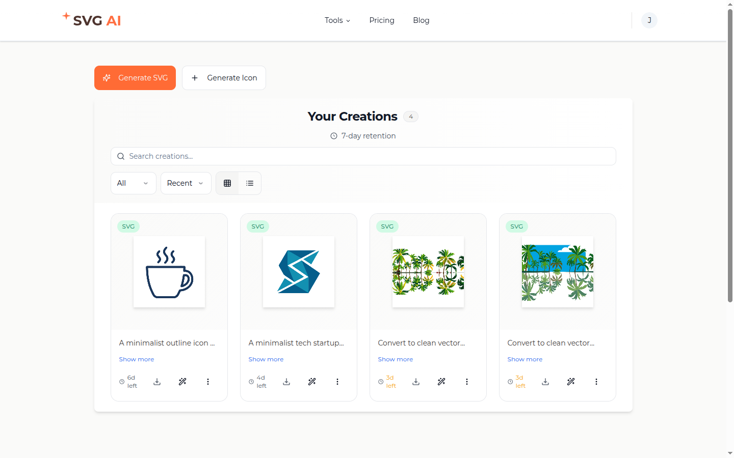
Keep the original export alongside your prepared and final versions. The dashboard screenshot below shows the saved-design workflow in an earlier version of SVG AI; keep local copies of assets your project needs.
 Sign up to get starter credits. Check the current credit estimate before generating and the account's paid access before exporting. Download availability and commercial use are separate questions; review the applicable terms and any reference assets.
AI refinement is useful for a visual instruction such as
Sign up to get starter credits. Check the current credit estimate before generating and the account's paid access before exporting. Download availability and commercial use are separate questions; review the applicable terms and any reference assets.
AI refinement is useful for a visual instruction such as simplify the gear teeth or make the lens larger. Preserve the original and compare the whole revised output: a local request does not guarantee that everything else remains unchanged.
Use text to describe a new concept, a reference image to show a visual direction, or both to state what should change. Avoid asking an image-generation step to enforce exact component attributes; currentColor, accessible names, IDs, and viewBox handling are implementation work after export.
For a consistent set, generate one icon first and inspect it at 24px before creating the rest. The matching-icon tutorial shows that creation process; use the sprite and component steps here to add the finished icons to your interface.
The icon-set preflight checklist
- Open all files and identify vector shapes, text, and embedded images.
- Preserve each file's correct viewBox; compare actual drawn bounds across the set.
- Apply
currentColor only to intended monochrome regions.
- Test 24px, 32px, and 48px on light and dark surfaces.
- Check informative labels, decorative hiding, named controls, and keyboard focus.
- Confirm that linked sprite IDs resolve and that no requests fail.
- Optimize copies only after the visual and interaction checks pass.
- Save a README that distinguishes raw outputs, manual normalization, and final assets.
Use a licensed library for a common metaphor when an existing style already fits. Draw manually when the requirements are exact geometry, a fixed pixel grid, or strict consistency with an established design system. Use an image to SVG converter when the task is tracing an existing image.
Generated drafts are useful for custom subjects, but a prompt is not a substitute for platform-specific export requirements, a matching-set review, or accessible implementation.
Best AI SVG icon generator for a developer in 2026
Use this svg icon maker when you need a custom source concept. Then treat the source like any other asset entering the codebase: inspect, normalize, test, and document it.
The AI SVG icon generator step solves visual creation. The component code above solves reuse and naming. Separating those responsibilities makes it clear which problems need a new generation and which need a small code or vector edit. Sign up to get starter credits.
Frequently asked questions
What is the best AI SVG icon generator in 2026?
Use SVG AI for a custom concept from a prompt or reference, and a licensed library for a common symbol in an established style. In either case, match the icon's visual weight, color, and size to your interface.Can AI generate consistent icon sets in one visual style?
A shared prompt stem and an owned reference help express the style. Compare the actual results at target size and correct differences before accepting a set.How do AI SVG icon generators compare to Iconify, Icons8, and SVG Repo?
Libraries provide existing icons with their own licenses. Generation explores a new concept. Both still need checks for visual fit and implementation.What does an AI-generated SVG icon look like in code?
An SVG contains a root element and shapes such as paths. The six examples here use a 2048-unit viewBox, with fills manually changed to currentColor for CSS theming. Other generated files may use different dimensions and colors.Can I use AI-generated SVG icons commercially?
Check the applicable product terms and the rights for any reference or third-party asset. Commercial use and paid SVG export access are separate conditions.How do I make AI-generated icons match my brand?
Supply an owned reference and explicit visual constraints, then inspect the output. Exact colors and component attributes may need manual normalization.What file size should an SVG icon be?
Set a budget for the interface. The six files measured here range from 874 to 6,753 bytes; simpler geometry can matter more than a fixed byte threshold.How do I implement an SVG icon in React?
Use the complete sprite-based component in this guide, or configure an SVG-to-component loader explicitly. Name informative icons and hide decorative children inside named buttons.Should I use SVG icons or icon fonts?
SVG gives direct control over individual shapes and accessible markup. Compare the trade-offs for your existing system; there is no universal performance winner for every delivery pattern.How do I make SVG icons accessible to screen readers?
Give informative SVGs a meaningful name, hide decorative SVGs, and put the action name on an interactive button. Test keyboard behavior and your target assistive technology.What's next
Ready for a custom symbol? Generate SVG icons, follow the matching-set tutorial to develop related designs, and use the interactive icon example to compare size and color behavior.
The best free SVG generators in 2026, beginner's guide, and SVG icons vs font icons cover adjacent decisions.